I took a look at the Harvard Library website over the weekend, to pick apart the elements of the site that I really like. First and foremost, I love the minimalist layout and color scheme. The white background makes it look less boxy, and the sections are separated by horizontal lines instead of rectangular borders. I know library websites are chock full of content that we want our users to be aware of, but when there’s too much content on a page, I find I can’t focus on anything.
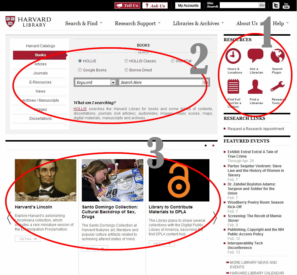
When it comes to details, I like the mix of text and images. They use icons in the upper right corner to draw attention to popular services (1). I think these are fairly good icon choices, but in general you have to be careful with them. You can get creative, but don’t use an icon that’s commonly known for one thing, for something else. For example, a wrench or gear(s) is often used for “settings,” so this icon can cause confusion when linking to something else. I think they’re ok here, though, since they include easy-to-read labels under the icons. (Joshua Porter just posted on the use of labels with icons. How fortuitous!)
It’s common practice these days, but I’ll mention it anyway: I like having the search box function front and center (2). I think this site does the service one better though, in including a “What am I searching?” feature. Library collections can be confusing, and often we have different search functions for different collections (catalog for books, integrated search for databases, digital repository for archives, discovery service for everything…) I know not everyone will read the text, but it’s concise enough not to be obtrusive, and adds useful information for anyone willing to scan over it.
The scrolling news items at the bottom of the page (3) offer another graphical element on an otherwise sparse page, and allow you to highlight events, collections and perhaps even offer a place for alternate entry points to resources for specific communities or to commonly-asked-about services. For example, you could create one specifically for students or faculty, or have one for using Blackboard, logging onto the campus network, or finding textbooks in the library.

The drop-down links at the top of the page (4) use symbols to denote internal links (which open in the same window) and external links (which open in a new window/tab.) This is especially important in library sites, as many resources we offer are provided by third-party vendors, and it can be disconcerting to click on a link and be faced with a different website, with a completely different look and feel from your own.

I’m just gonna go ahead and say it. I like deep footers (5). It was at a workshop a few years ago, where a presenter was talking about the NYPL migrating to Drupal, where I first met the deep footer (you can see it in action here), and though I can’t remember if it clicked for me right away, or if it upset my 2002 web developer sensibilities, I now think of it as a great, unobtrusive way to add relevant links to your site. I like it especially as a place for all your social media links/icons, as well as for links to content that your users might find useful, but that are outside your own site. For academic libraries, those links might be to the school registrar, the writing and/or tutoring center, and the academic calendar. Especially since many university home pages are catered towards prospective students, rather than current students, these links can help position the library’s homepage as a portal for students who want to access information and resources for the school as a whole.
Finally, I like that when you scroll over the drop down link boxes, you can not only click on the links that appear in that drop down menu, but also the main category under which they are grouped. This gives you a landing page for each category, and a chance to help guide users who want more information on that category, or aren’t sure which link they need in the group. The only thing that threw me a bit, was that the landing page links did not match up more closely with the options in the drop down (6). This creates a bit of a logical disconnect in terms of “training” users on navigation. (ie- If they visit the landing page on their first visit, does that help them understand and be able to use the quick navigation on their next visit?)
One final note regarding accessibility: When I learned html (many moons ago) you used the “alt” attribute for both accessibility and as a way to provide information via mouse-over text (or “tooltips”.) While poking around in the code of this site, I noticed that they were using both an “alt” *and* a “title” attribute with most of the images. Apparently, it’s now standard to include both of these, as not all browsers will render the “alt” tag as a tooltip if the “title” is absent (which used to be the case.) So you want to include an “alt” description for accessibility (and for images that don’t display) and a “title” description with whatever information you want the user to see when they mouse over the link or image. For a more thorough explanation of the alt vs title attribute, see: http://www.456bereastreet.com/archive/200412/the_alt_and_title_attributes/
To learn more about how screen readers treat various html elements, I found this resource helpful: http://webaim.org/techniques/screenreader/ (If your library uses LibGuides, they also have an accessibility page, with info on what they do, and what you need to do, to ensure 508 compliance: http://help.springshare.com/accessibility)